Rating (Likert) Scales
Warning
This page may take a long time to load. We’re working on it.
We use surveys to measure people’s attitudes all the time and one common way to code answers is using a Rating scale or Likert scale. These are used to allow survey-takers to express how much they agree or disagree with a statement (strongly disagree - disagree - undecided - agree - strongly agree).
There are variations to measure frequency (never - rarely - sometimes - often - always), importance (unimportant - slightly important - moderately important - important - very important), and quality (very poor - poor - fair - good - excellent), among others.
These are, what is known as, categorical scales - each answer is its own discrete unit, you cannot answer ‘somewhere between slightly important and moderately important’, you must choose one. These are also ordinal scales - the order matters; ‘often’ is more than ‘rarely’ and ‘slightly important’ is less than ‘moderately important’ in their respective scales.
Just like with most tasks in data visualization, there are many different ways to visualize this data and there is not one right answer.
In this guide we will go through a few ways to visualize rating-scale survey answers.
What the data looks like
First, let’s think about how the data looks like. This is from FiveThirtyEight’s Oxford comma survey.
This is an agreggated table of answers as you might get from the survey service of your choice.
💡Note: If you received the raw data or individual-level answers, you are going to have to aggregate it yourself. This is easy with pivot tables in excel or using any other data analysis software you prefer. For examples using excel, R and python you can visit the tidy data section of this style guide. {: .notice–info }
What can you tell from this table so far?
There are 4 columns/answers - not 5. This means our scale skips the
neutral/undecidedscale point. Is it because people did not answer the question or because no one actually feels indifferent about Oxford commas? (Impossible!)This table shows total counts - not shares. This means we need to do some more data cleaning ourselves!
What else can you derive from this table?
Color schemes
Before diving in further, it is useful to think about the colors we will be choosing for our visualization. Looking at our data categories, we know the answers span from one extreme to the other (Not at all to A lot). These are opposites and that means we need to use what is known as a diverging color scheme. Diverging color schemes are composed of three colors: one for each end and a neutral color. Gray or white is a common choice for the neutral color. Each of the other two colors sit at the end of the scale and we use lighter and lighter shades of those colors as we approach the center (neutral).
Keep in mind colors have connotations: when you see something go from red to blue most people assume it’s going from bad to good. Having the “positive” end of the spectrum using Red and the negative using Blue could be misleading.
The color red also tends to be seen as a negative in Western societies especially when we are dealing with numbers. If you prefer not to use red, try using other colors like our yellow to blue scale instead.
Examples
Let’s go over some ways we could visualize this dataset. Remember, there is not a right answer here. Data can be visualized in many ways and each of them emphasizes and downplays certain aspects of your data. What you want to tell with your data is your choice but please remember to be responsible and honest.
Bar charts
The simplest chart we can create with our data as it is is a bar chart. In this case, these bar charts emphasize the largest share of the total (i.e. “the biggest share of those who make $150,000+ a year are those who care ‘some’ about the use of the word ‘data’ as a plural or singular noun”).
This is not particularly useful, as we are highlighting one of the two possible positive answers (‘some’ and ‘a lot’). It is not clear if the sum of both “Some” and “A lot” is larger than the sum of “Not at all” and “Not much”.
This type of chart could be useful if there is one category that is clearly much larger than the other three for most groups. Take a look:
This logic is true for horizontal bar charts too.
Pie charts
Pie charts emphasize the idea of a section being part of a whole. In this case they also facilitate grouping sections in our minds. We can easily see whether the reds or the blues are larger than the other.
Pie charts sections, however, can be hard to interpret if there are too many sections or if these sections are not common fractions like 1/3, 1/2, 1/4, etc. It’s easy to tell when a section is one quarter or 25% of a pie. It’s harder to tell when it is 17%.
Diverging stacked bars
Another common way to visualize this type of data is using diverging stacked bars. Instead of placing each answer as a bar next to each other we essentially create two bar charts next to each other going in opposite directions centered at 0%. Here is an example from Pew Research Center
First two tabs showing off defining a function.
How much, if at all, do you care about the debate over the use of the word “data” as a singular or plural noun?
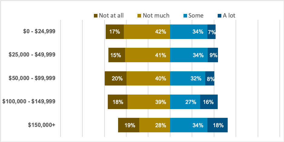
Fig. 4 Yellow-blue diverging stacked bar chart.
This takes care of our regular bar chart problem where you could not tell right away if the aggregate of “blues” was greater than the aggregate of the “reds” (or “yellows” if you are using our other scale). Kind of.
Diverging bar charts group similar answers together and that is helpful but if the aggregates are not significantly different it might be hard to tell which side of your chart is larger. There are pros and cons to everything.
Another disadvantage diverging bar charts have has to do with the middle value (usually "neutral"). Our data in this case happens to not have any “neutra” or “undecided” answers so we can start each of our sides at 0% but what would we do if we did? That would be up to you. Many data journalists have picked up the practice of creating a separate bar chart to display only those “neutral”/”undecided” values so as to not disrupt the diverging bar chart.

If you decide you want to try to use this type of charts we have included an excel workbook you can use as a start: [link to workbook]()
Stacked bar charts
Our last example is stacked bar charts. Stacked bar charts are, as the name suggests, charts that stack bars on top of (or next to in the case of horizontal charts) each other. Instead of each group (in this case our income groups) having 5 bars displaying the share of each possible answer they have one bar going from 0 too 100% with four or five sections differentiated by color.
This has the advantage of making our chart more compact. It also, like pie charts, emphasize each section/answer is a “part of a whole”. It is also easier to tell “which part is bigger” (blues vs red/yellows) if you add a label at the 50% mark. If either section crosses said mark you know it holds “the majority”.
Further reading
Horizontal bar charts
See bar charts section.